
Friday, February 25, 2011
Wednesday, February 16, 2011


Saturday, February 12, 2011
iar 202. jenga 2.0 reflection.
Yesterday morning in studio we had a "silent" critique of Jenga 2.0. We were not allowed to say anything about our own work, but were to discuss the strengths and weaknesses of each other's work.
As a group, I think we did a great job on this project. I am always impressed by my classmates. I was a little bit surprised about the positive critique of my work, I suppose because only I notice all the little mistakes…
My decent time management paid off this time, and just in time. The things I need to work on relate mostly to board layout. The text should be integrated more fluidly with the images on the boards, and there needs to be some more visual contrast and depth. For both Jenga 1.0 and 2.0, I didn't focus very much on color, partly because I wanted to focus mostly on form. However, I think my project - and my boards - could have been more interesting with little bits of color here and there. I did include a dark orange hue for a few parts of my boards, but printed in black and white (cheaper at Kinko's). So that was kind of useless.
Indeed, it seems that board layout is what we as a class need to work more on. It should be said, however, that our board layouts would inevitably improve if we had more time for each project…
I am looking forward to the group project we have just embarked on. I've been stuck with just my own ideas for a little too long.
iar 202. jenga 2.0.
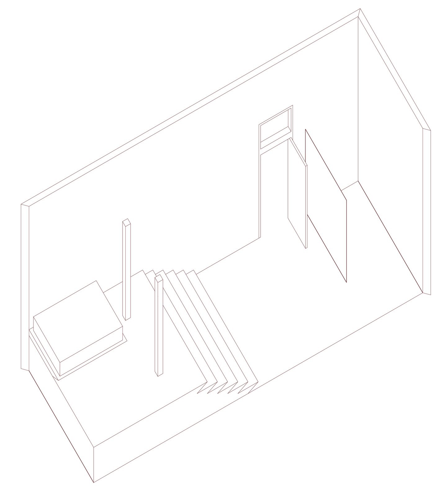
Jenga 2.0 required us to further develop just one of the three spaces we designed in Jenga 1.0. We were required to add another level (either below or above the existing level) that comprised only 50 percent of the area of the original space. In doing so, we could revise our original design if needed. The space chosen for me (by Patrick and Claire) was the "idea room" - the one that focused on the crystallization of an idea.


The text on the second board reads:
"These two spaces (which function as one whole) are all about circulation and how it can symbolize the formation - or crystallization - of an idea. One enters from the smaller, lower level and begins a journey as one's path travels upwards and spirals inwards toward the center of the larger space above. A kitchen area and a workspace are located on the lower level. Carved into the solid that forms the "spiraling" platform in the upper level are a bathtub, a toilet, and a sink. An alcove on one side of the solid provides a private space for sleeping.
A tall, cylindrical platform in the center of the space marks the final destination and symbolizes the complete crystallization of the idea. It is essentially a place for rest and meditation. Its circular shape contrasts with the square elements of the room, thus setting it apart as a unique feature. The staircases and platforms in the spaces are made of DuPont Corian acrylic.
Lighting, provided by recessed lights in the ceiling, is minimal in the lower level but increases as one travels inwards toward the center of the upper level. The largest of the lights is located directly above the cylindrical platform."


Tuesday, February 1, 2011
iar 202. jenga 1.0 - peer review for Jasmine
Jasmine's concept word was "clockwork," and she did a good job of abstracting this word in order to design three different spaces. In examining these spaces, I have included images of her hand-drawn floor plans because, of all her drawings, they seem to communicate best.
space no. 1:

For the 11' x 32'4" space, Jasmine focused on the idea of rhythm. The space has an axial plan, and she used her kit of parts - two columns and a wall - to communicate a regularity in the space, suggesting a rhythm.
diagram:

---
space no. 2:

Jasmine's 22' square space is all about the precision of clockwork. Just as a clock ticks evenly, the room has an "even" and balanced feeling. Jasmine explains it: "In this 22x22 space not only is the space with in itself even the rooms are also equally subdivided. Clocks tend to move at equal intervals and the space also plays of the idiom "like clockwork". The kit in this space was two walls one column. The column can be used as a light to tell time lighting up in twelve section (1 light= 1 hour). The two wall start at 3 and 9 and turn like the hand of a clock to face 12 and 6."
diagram:

---
space no. 3:

For the 22' x 32'4" space, Jasmine focused on the movement of clockwork. She used two solids to evoke the idea of gears without being too literal. To bolster the idea of movement, Jasmine included a movable table in her design. She explains, "There are also level changes in the space to signify the interworkings of a clock a different points."
diagram:

Like Abigail, Jasmine did a good job of presenting her project despite having stayed up all night. Her concept was clear throughout.
iar 202. jenga 1.0 - peer review for Abigail
For our first studio project, Abigail's concept word was "joint." Using this one word, she designed three retreat spaces that revolve around this concept, each in a different way. A common theme in Abigail's three spaces is the fitting together of different parts, not necessarily a person's circulation of space throughout the room. Therefore, it is easier for me to diagram individual parts and/or concepts rather than each entire room.
space no. 1:

In the 11' x 32'4" space, Abigail wanted to emphasize the joinery and craftsmanship of woodwork. Wooden beams on the ceiling reinforce this idea. Her kit of parts for this space was two columns and a wall. She manipulated the columns quite cleverly by "bending" them to give them both a vertical and a horizontal quality. In this way, they can provide horizontal surfaces for food preparation and consumption. The two columns appear to be "joining together" at their ends. For this space, her axon drawing demonstrates her concept most clearly.
diagram:

---
space no. 2:

In the 22' square space, Abigail wanted to emphasize the idea of two things joining together into one. She chose to use two solids for this space. The solids are located at opposite ends of the room.
Because my own words would be inadequate, I would like to quote her at this point: "On one side of the space, everything is carved from the wall. There is a place for sleeping, a closet, a table, and a place for bathing. On the opposite side of the wall, everything that was negative space on the right wall, was extruded as a solid on the left wall. So, in theory, of a force was to push the two sides together, they would fit together as a whole like two puzzle pieces."
Her section drawings most clearly present this space, as they show how the two sides of the room could potentially fit together.
diagram:

---
space no. 3:

In the 22' x 32'4" space, Abigail focused on what she calls the "mechanical aspect of joints, like a joint found in the body." For this space, her kit of parts was two walls and a column. She demonstrated her concept by making one of her walls a movable wall which can fit perfectly together with the other wall if desired. For this space, Abigail's axon drawing speaks most clearly.
diagram:

For all three spaces, Abigail's presentation was clear and well thought out. She was remarkably alert after the long night we had all just endured.
iar 202. jenga 1.0.

http://chestofbooks.com/food/science/Experimental-Cookery/images/Fondant-15.jpg
Crystallization... interpreted three ways.
space no. 1: the "crystal" room
kit of parts: two walls and a column
This space is intended to reflect the properties of a crystal in its symmetry and transparency. The space measures 32'4" by 22'. One enters the room from a door centered in the wall and ascends six steps to a higher level which rises three feet from the ground. A small pool, seven feet square and three feet deep, welcomes the occupant upon ascension. The pool serves for bathing, relaxation, and meditation. A glass column rises from the center of the pool. Directly above the pool, a projection from the ceiling echoes the interior void of the pool. Built into this projection are lights to illuminate the water. Natural light comes from six windows on the wall opposite the entrance and four windows on the wall to the right. A seven foot long inward-facing couch faces the pool on either side, the back of which is a glass wall, eight feet high. The walls, although transparent, provide divisions within the space to set apparent various activities. To the right of the pool, behind the glass wall, is a kitchen area. To the left of the pool, behind the second glass wall, are a toilet and a sink.
To enhance the luminosity of the room, pendant lights hang from the ceiling, above the higher level. Each pendant has a center light source, around which delicate slivers of mirror hang to catch the light.


ceiling plan

section A-A1

section B-B1


---
space no. 2: the "liquid to solid" room
kit of parts: two columns and a wall
This space is about the process of crystallization - a shift from liquid to solid, water to ice. The room is very linear, measuring 11' x 32'4". One enters opposite a long wall containing six windows. Six windows are located on the wall opposite the door, which serves to illuminate the entire space. The left side of the room has asymmetrical and transparent qualities and houses the bathroom and kitchen facilities. A glass wall, seven feet long and seven feet tall, shields the shower and toilet from view. The bottom half of the wall is frosted for privacy, whereas the top half becomes increasingly more transparent. Beginning halfway along the length of the room, on the right side as one enters, six stairs ascend to a higher level, which rises three feet from the ground. Above, the ceiling plane mirrors the floor level change exactly, creating a very "solid" feeling, as if the ceiling and the floor are closing in on the occupant. As one ascends the stairs, a column on either side serves to frame the space and enhance the feeling of solidarity. The "solid" half of the room - consisting of the floor and ceiling alterations and the columns - is reserved for sleep and relaxation. Recessed lighting in both ceiling elevations illuminates the room.


ceiling plan

section A-A1

section B-B1


---
space no. 3: the "idea" room
kit of parts: two solids carved for occupation
This space is the most conceptual of the three, and therefore the one that I prefer. It is about the crystallization of an idea. The space is a square - 22' x 22', with two windows on the wall opposite the entrance and two windows on the adjacent wall to the right. One enters opposite one of the window walls and immediately begins a journey as one's path spirals inward and upward toward the center of the room. In the four corners of the room are objects to serve the necessities of life. In one corner is a cushioned bench for sitting/resting/sleeping; in another corner, a kitchen area for food preparation; in another, a bathtub for bathing; and in another, a toilet for the elimination of waste and a sink for cleanliness. These objects are placed intentionally on the periphery of the room. One may step off the "path" to engage in these activities for a time, but must return to the path in order to arrive at the final destination. Positioned centrally in the room is a stair-like platform which forms the first solid and represents a continuation of the journey one undertakes in the formation of an idea. Inside the first solid (but not entirely enclosed) is a raised circular platform - the second solid - upon which one sits after ascending by means of the first solid. This represents the complete crystallization of an idea. Recessed lighting illuminates the entire room, but the majority of the light is focused on the two solids. Directly above the second solid hangs a glowing sphere, representing the purity and completeness of the crystallized idea.


plan with circulation path

ceiling plan

section A-A1

section B-B1


Subscribe to:
Comments (Atom)