Saturday, March 24, 2012

iar 302. studio redesign observations.


Our second studio project for this semester involves designing improvements to our current studio space as well as other portions of the Gatewood building that affect us in some way. Besides an autonomous project in first year, this is the most open-ended studio project I have been assigned thus far. The improvements each individual or group will be proposing can take any form whatsoever; consequently, the deliverables we craft and present must necessarily vary from project to project.


After learning the results of department-wide surveys and interviews conducted by some of our classmates, it seems that most IARc students find the studio inspiring only because of what we bring into it: ourselves, our inspirations, and our projects. The physical space itself - the portion of the building we inhabit - doesn't always evoke positive emotions; in some cases, students divulged that the studio evokes negative (sometimes powerful) emotions. I am inclined to think that these negative reactions are actually due largely to the stresses of school projects. During class discussion on Friday afternoon, Kayla also brought up a good point: maybe we find the building uninspiring because we spend too much time here. The problem isn't necessarily the building itself, but the fact that we don't leave it often enough.


Nonetheless, there are undoubtably many areas in which the Gatewood building (and particularly our third and fourth floors) can be improved, both functionally and aesthetically. Major problems with the current studio environment include:


- poor acoustic quality

- lack of adequate storage space

- lack of adequate pin-up / presentation space

- lighting that doesn't suit the tasks at hand

- temperature fluctuations

- awkward placement of electrical outlets in the concrete floors (and poor access to electricity sources in general)

- desk chairs that break easily

- lack of easy access to healthy food

- lack of lounging space

- a computer lab that does not fully meet student and faculty needs


Following is a list of some noteworthy ideas for improvement, suggested during class on Friday:


- converting the vending machine area (in the student lounge on the second floor) into a small cafe space serving coffee and hot meals

- more work space for larger-scale projects

- reusing material from the existing model stands to make new ones that are more useful and aesthetically pleasing

- a separate computer lab solely for digital rendering

- more inspiring / aesthetic furniture choices

- a more official place to store free scrap materials


With so many options for positive change, especially in the context of such a flexible assignment, I initially had difficulty discerning a feasible direction of focus. However, after discussing my ideas and allowing them to develop naturally, I was able to envision an exciting design proposal. Kelly Harris and I have decided to collaborate on the design and construction of a multi-purpose furniture piece to accommodate the equally important tasks of working and presenting. In proposing this design, we also intend to incorporate colors and other visual cues that reflect IARc's collective personality and core values.


As conscientious student designers, we should desire to improve the studio not only for ourselves but also for future students of the IARc program. A short time from now, we third year students will be preparing for graduation and leaving the Gatewood building behind. How will our visions and our efforts, begun in the remaining weeks of this semester, positively affect kindred designers who have yet to enter the program?

Thursday, March 15, 2012

iar 302. community, authenticity, innovation, stewardship.

Word: COMMUNITY

Meerkats live in tight-knit colonies, are very social creatures, and always seem to be on the lookout for the safety of the community. They are known to exhibit altruistic behavior and to care for each other's offspring. It is amazing how closely these behaviors resemble interactions within small human communities.


Word: AUTHENTICITY

In contrast to modern representations of Ancient Egypt, the Great Pyramids at Giza are an authentic piece of its physical history. The civilization has become so iconic that symbols of its culture are instantly recognizable and appear frequently within modern contexts, including the Western world. As such, information is lost or distorted via time and distance. A visit to the actual pyramid sight (which I have not had the pleasure of accomplishing) would seem a surreal and awe-inspiring experience.


Word: INNOVATION

Mankind is always looking for ways to manipulate the elements of nature to suit its needs and motives, often to a destructive end. Particularly in the context of warfare between nations and people groups, innovative minds develop technologies to aid in the defense or acquisition of territories and resources; the protection of group members against attack; and the destruction of rivals. In cases resulting in outcomes such as the explosion pictured above, the natural world and its living inhabitants can be threatened, maimed, or obliterated.


Word: STEWARDSHIP

A good steward takes care of what has been entrusted to him. This man is presumably the grandfather of the child, and he is taking on the responsibility of devoting time, care, and attention to what he has been blessed with. In a sense, it could be said that the man is a steward over what is not completely his; his son or daughter likely fills a parental role for the child. The concept of stewardship in regard to fellow human beings - particularly posterity - has deep implications for the future.


I've come to the conclusion that authenticity, innovation, and stewardship are all important "ingredients" in the formation of a healthy design community.

Monday, October 17, 2011

iar301. assignment 2.0 - schematic design.

For studio assignment 2, each of us in Travis's studio designed a Solar Decathlon-style house based on a personal analysis of the way we live within our own dwellings.

My design was grounded by several basic ideas:
-being sheltered/surrounded by nature
-the articulation of corners
-public and private separation
-capture


Inspiration came from nature in general (specifically, dense foliage and greenery) and the work of Frank Lloyd Wright, although not initially. Rather, my design had already progressed quite a bit before I realized how it related to any design precedents.


Some process work:


The design:

public entrance

private entrance

Renderings:


Physical scale model:

iar301. assignment 1.0 - analysis.


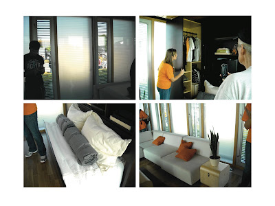
This semester, Travis's IAR 301 studio has been focusing on the Solar Decathlon, a zero energy residential design competition held every two years. This year, the competition took place on part of the national lawn in Washington, DC, where each house was constructed on site from modular parts traveling in from all over the world.
From the beginning, each student in our class was assigned a different team's design to analyze through research and the production of two- and three-dimensional diagrams. During the weekend of September 30th-October 2nd, our class traveled to Washington, DC and toured the houses firsthand.
Below is my personal analysis of the Living Light house, designed by the University of Tennessee.

(construction documents borrowed from http://www.solardecathlon.gov/team_tennessee.html)